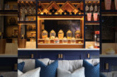
A sales centre is the first physical space potential house hunters will encounter. So how do you make the right first impression whilst also creating a productive workplace?
Steve Hird, director at new home interior design specialists, Edward Thomas Interiors outlines your top interior design priorities.
Visibility and navigation
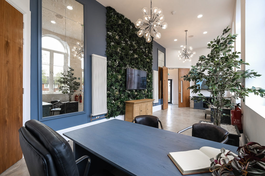
First and foremost, visitors need to easily locate and access a sales centre. The building itself needs to be prominent and visible, and for this reason our preference is always to have a standalone sales centre rather than one which is integrated as part of the showhome. Integrated sales offices can compromise the house, some house hunters are visual and seeing a living room styled as an office for example may hinder them imagining its original purpose. If there’s not an option for a standalone then consider removing any non-load bearing walls to help create a more open plan environment.
For standalone sales centres, visibility of the sales advisor is essential. When you walk into an unknown space it needs to feel welcoming and easy to navigate. Opening a solid door doesn’t allow this so make sure to opt for full glazing and glass doors to help wayfinding.
 Functionality
A good sales centre needs to have dual functionality. Firstly, it needs to be an inviting and informative space for potential purchasers and secondly, it’s a place of work for sales consultants. To balance these requirements, we advocate creating different ‘zones’ e.g. working areas, a meet and greet space, casual seating, private offices, VR rooms, and an options/choices suite. This not only aids differentiation but also enables multiple visitors to be accommodated at the same time.
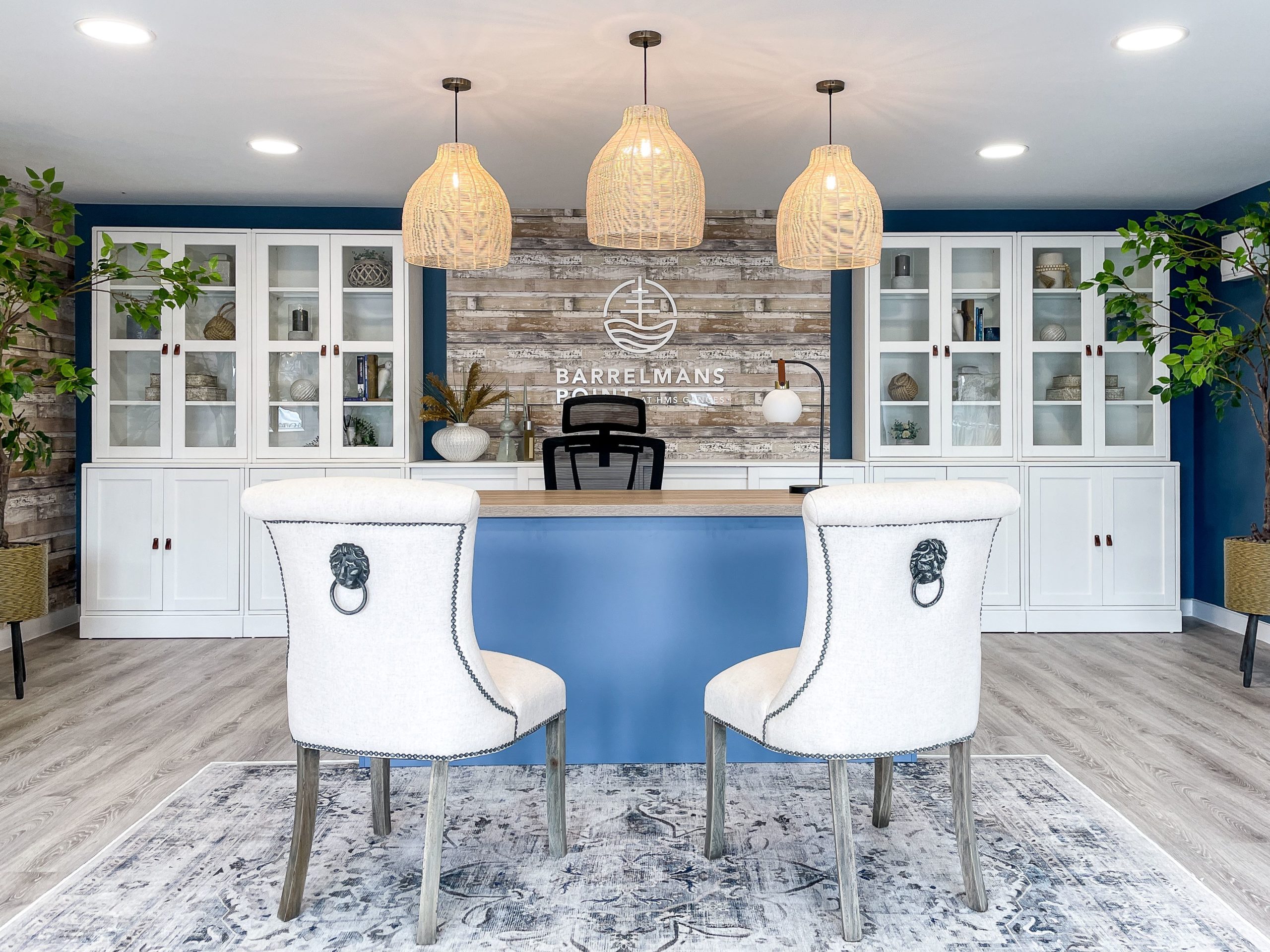
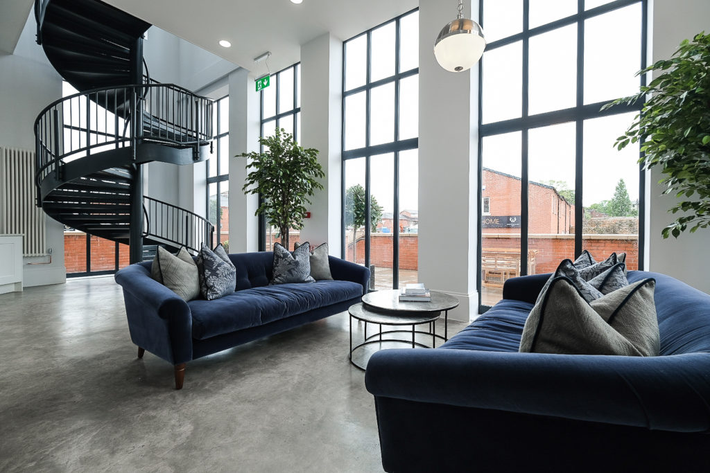
Key to the success of these zones is quality materials. A sales centre might be open daily for three-plus years, meaning any materials should be selected for longevity and durability. Once a sales centre is installed, it typically isn’t refreshed so needs to stand the test of time. Opt for fabrics such as leather, velvet or wool, wall treatments to draw the eye, and a hard flooring like an LVT, which can be laid in different configurations to create a striking appearance.
 Branding and presentation
Of course, material selection is largely informed by brand. A brand presence and continuity across all live developments is important but we do advise allowing room for site appropriate design. Distinctive sales centres incorporate elements of the location or a connection to the showhome. For example, in rural locations we’ve used panelled storage doors and farmhouse style furniture to create a country aesthetic, or in coastal environments we’ve incorporated traditional colour palettes or whitewashed furniture. There are anomalies to this where designs need to be entirely bespoke e.g. to retrofit an existing building or honour site heritage, but my point is that these considerations make a more memorable environment.
Presentation is the other essential for making somewhere memorable and creating that all-important positive first impression. No house hunter wants to walk into an untidy office and feel like they’re imposing. Hidden storage for brochures, PPE and other equipment should be included. Consider bespoke cabinetry or panelled or living walls around TV(s) for this.
 Lessons from retail
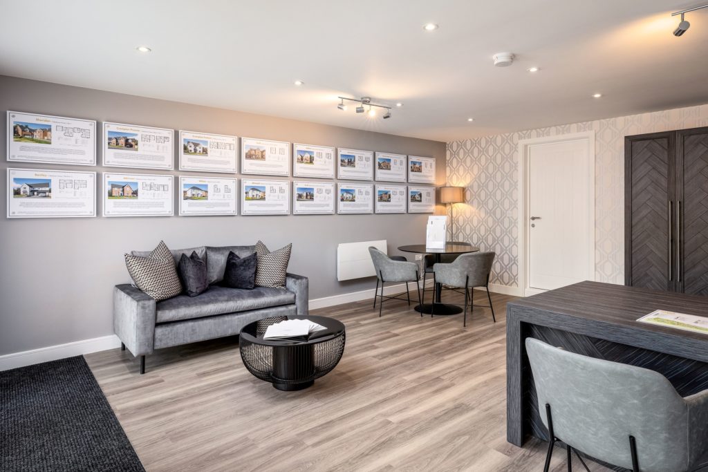
To remain competitive in the current market, developers are offering even more choices or upgrades and therefore the display of these has become critical. We’ve taken cues from retail so everything is displayed to sell, meaning it is visible and easily comparable with each other and the standard range. This includes necessary choices such as cabinetry, tiling and flooring but more recently we’ve incorporated displays for electrical sockets, taps, sinks and shower heads.
Another growing trend is the use of digital technology, and again we follow retail examples for the presentation of these tools. Interactive touch screens are grouped together to be easily accessible and user friendly. Where developers offer site tours through VR, we’re creating separate cinema-style rooms to ensure these can take place privately and not distract from the main selling areas.
 Comfort
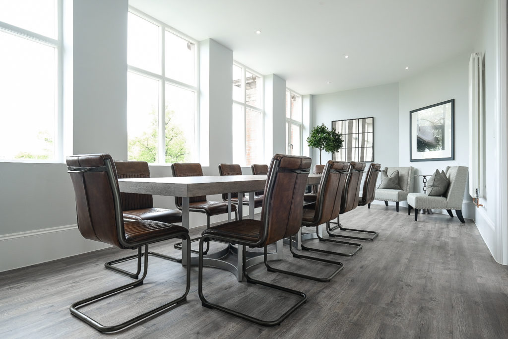
The final piece of advice is perhaps the most important. Buying a house is one of the biggest decisions people make so they need to feel comfortable and relaxed to do so. A sales office should have that cosy, ‘at home’ feeling. There needs to be enough furniture for it not to feel sterile, a pleasant fragrance or scent, greenery, warmth and texture.
Want to know more?
For more information, click here

