Martha Dunican, Colour Operations Manager at Dulux Trade, explores the impact of paint, and colour, on occupant outcomes in homes.
The World Health Organisation forecasts that stress related illness will be the primary cause of sickness by 2020. It’s no surprise that, in our increasingly always on, technology driven world, people are now investing in physical and psychological health.
The global wellbeing market has grown by 18 per cent in the last two years alone to $4.2 trillion, exemplified by the growing desire to ensure our health, particularly in the design of our homes.
Our researchers have been investing substantially in research, working to develop frameworks that show just how powerful colour and design is in the built environment.
The human touch
Trend analysis shows that while we are surrounded by technology, extravagance and distraction – there is a growing desire to strip things back to basics and welcome the beauty of imperfection.
It is insights like this that have informed the development of the Dulux ColourFutures 2020 palettes. The universal theme for 2020 reflects a desire to create more opportunities to experience ‘A Human Touch’ at work and home, at a time when advances in technology are making us feel increasingly disconnected from each other.
People are seeking more positive real-world experiences that provide maximum benefit in a short space of time. Architects and designers can use colour to encourage making better human connections, enhancing wellbeing and productivity as a result.
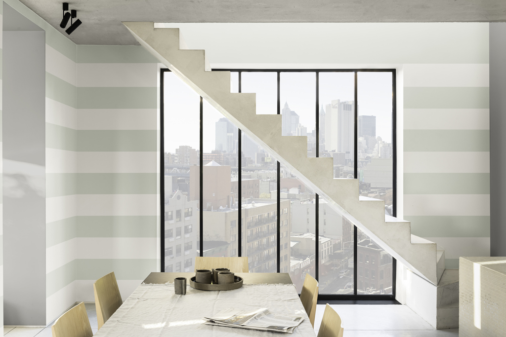
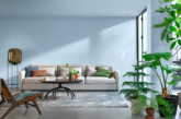
The new Colour of the Year, Tranquil Dawn is a versatile, soft green hue with a calming, restful quality that perfectly supports our inclination to blur the boundaries between our indoor and outdoor spaces. Its almost ethereal dimension creates an illusion of space and perspective, a nod to the biophilic design values that espouse the benefits of a greater connection to nature, natural materials and daylight.
An eminently usable shade of green, Tranquil Dawn will happily stand alone in a home, creating a restorative overtone, or can be paired with other colours within each of the four supporting palettes: Care, Play, Meaning and Creativity – where Tranquil Dawn provides a soothing anchor to pops of richer, more dynamic shades.
Dementia care spaces
Dulux Trade are advocates for the positive effects that inclusive colour and design can have on occupants within healthcare, particularly for people living with dementia.
The number of people living with dementia in the UK is set to top one million by 2025, with 70-80% of those continuing living with the condition currently staying in their unadapted homes.
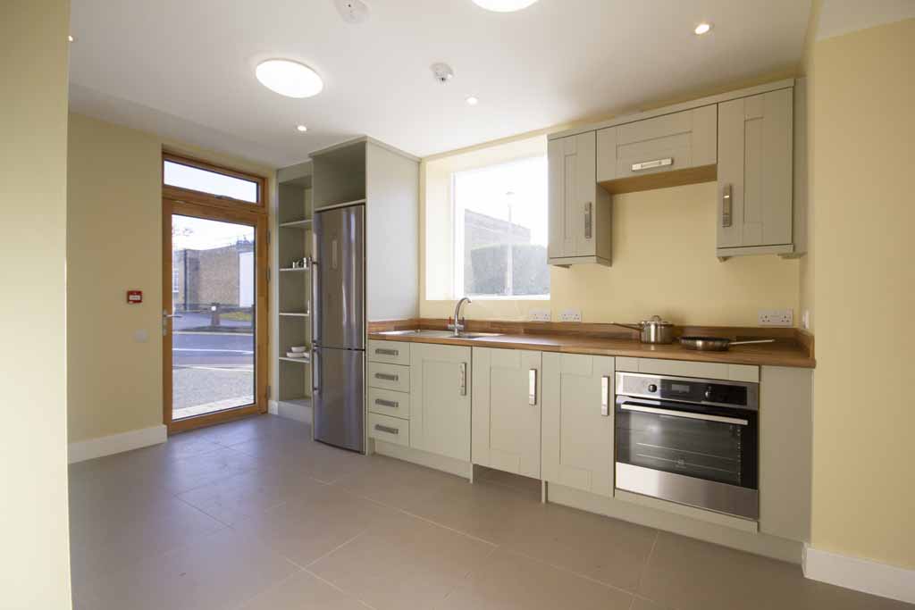
We have supported the BRE Trust, BRE, Loughborough University, Halsall Lloyd Partnerships and Liverpool John Moores University, with the development of a demonstration home to present evidence-based design, adaptation and support solutions that allow people to age well at home.
The colour schemes used within the demonstration home have been developed as part of a holistic occupant-centred design consideration, evidencing how wall coatings are able to transition from simply delivering core functional performance or aesthetic requirements, to making a valuable contribution to the wellbeing dimension of a specification brief.
Colour and design
Supporting this initiative, Dulux Trade have curated a Dementia Colour and Design guide providing a mini colour palette and a summary of the best practice inclusive design techniques and applications.
Inclusive design encourages the application of colour to enable occupants to more readily identify different areas of the entire living space – balancing their needs alongside the needs of their carers or family and giving them greater confidence to move independently within their home, whilst also reinforcing positive personal connection with the surroundings to provide the necessary stimulation.


