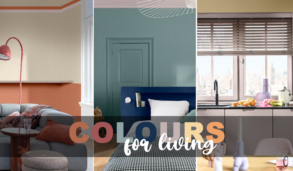
When it comes to housing design, selecting colours for each room is more than just an aesthetic choice – it’s about creating spaces that evoke the right emotions and improve wellbeing. Dawn Scott, senior colour designer at Dulux Trade, sheds light on the significance of colour and design in making living spaces welcoming and homely.

It has been said that people can spend as much as 90% of their time indoors, and with the growth of remote working more and more time is being spent at home. To make people feel relaxed, comfortable and at ease within their own four walls, housing developers need to carefully consider the design and colour of their properties.
The way people engage with and feel in a space is hugely influenced by colour and design. Whilst everyone has their own individual taste, there are some rules of thumb that should be adopted when selecting paints and coatings.
Entrance Ways and Hallways
The moment residents step into a property, they should feel welcomed and at ease. To achieve this with colour, consider warmer, more saturated hues like copper or taupe like shades. Alternatively, bright, and cheerful tones like ochre or lilac, can infuse a sense of joy and friendliness into these spaces.
 Kitchen and Dining Areas
Kitchens are often bustling with activity throughout the day. To reflect this energy, opt for modern tones like pale blue or creamy off whites to bring a sense of happiness. For those who perceive the kitchen as a peaceful and comforting place to gather, shades like pumpkin or bronze are an excellent choice.
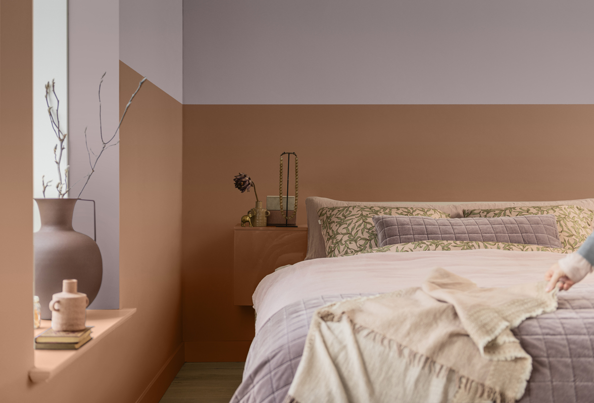
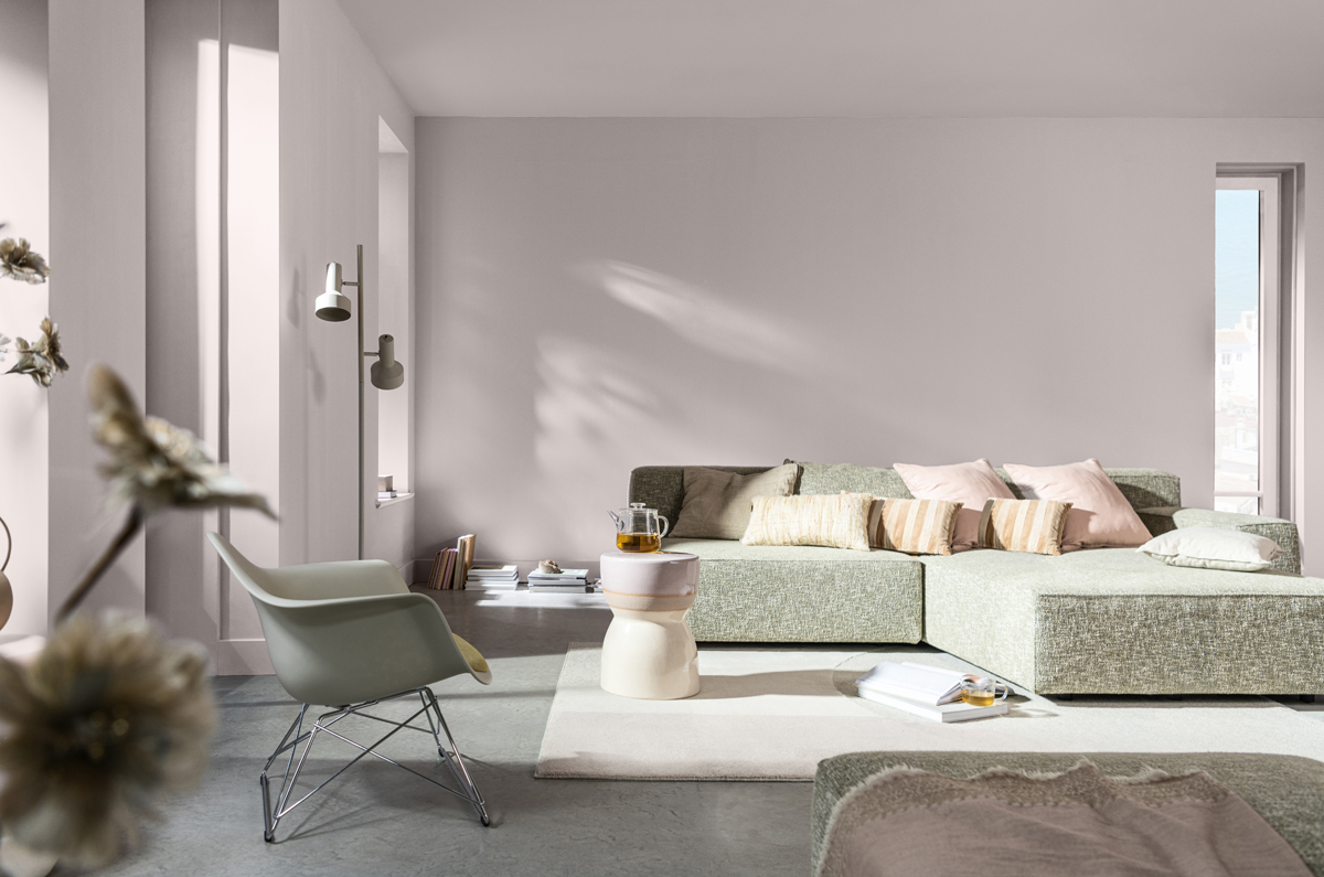
Bedrooms and Living Spaces
In the bedroom and living areas, residents should instantly feel relaxed, warm, and cosy. Colours that draw inspiration from nature like soft blues, calming greens and neutral biscuit hues can be used to create a sense of belonging and help residents to unwind.
Bathrooms
While bathrooms are a place of relaxation for some, they are also the space where many people start their day. To bring bright energy into the bathroom for early risers consider colours like ochre or lilac. For a more relaxing bathroom choose tones like deep blues or pale slate.
 Paint type
As well as colour, it is also important to carefully think about the type of paint used and the benefits it offers. Opting for a durable product is ideal for areas such as hallways, kitchens and dining rooms. It is also important to consider the sustainable credentials of the paint, such as whether it’s essentially 99.9% VOC free and compliant with BREEAM and LEED certifications.
BOX OUT
For 21 years, the Dulux Colour of the Year has been decided based on extensive trends research conducted by in-house experts and international design professionals. The colour for 2024 is Sweet Embrace, a delicate, welcoming and soothing colour. In addition, designers can also draw inspiration from the Warm, Calm and Uplifting supporting palettes. Each palette can be employed to evoke emotions in residents, promoting their well-being and creating homes that people will cherish.
Want to know more?
Further advice on specifying paint for housing projects
More information about the Colour of the Year 2024