One reason for buying a new home is because it can be entirely personalised. Steve Hird, director at Edward Thomas Interiors, looks at the evolution of options suites and why housebuilders should take cues from retail.
As buyers are exposed to more choices via social media and online platforms, the expectation for an ‘experience’ or ‘journey’ is even more prevalent. High street stores and car retailers are creating incredible, Instagrammable spaces for potential purchasers and housebuilders need to follow suit.
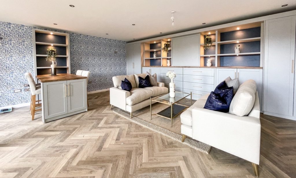 In the last decade or so, the sales centre concept has really evolved and a significant part of this is the presentation of options and upgrades. It’s no longer acceptable to portion a tiny corner of the sales cabin with a handful of choices. To remain competitive, housebuilders now need a dedicated area, away from the main point of enquiry, where purchasers aren’t rushed and can make decisions in peace.
So, what should an options centre look like?
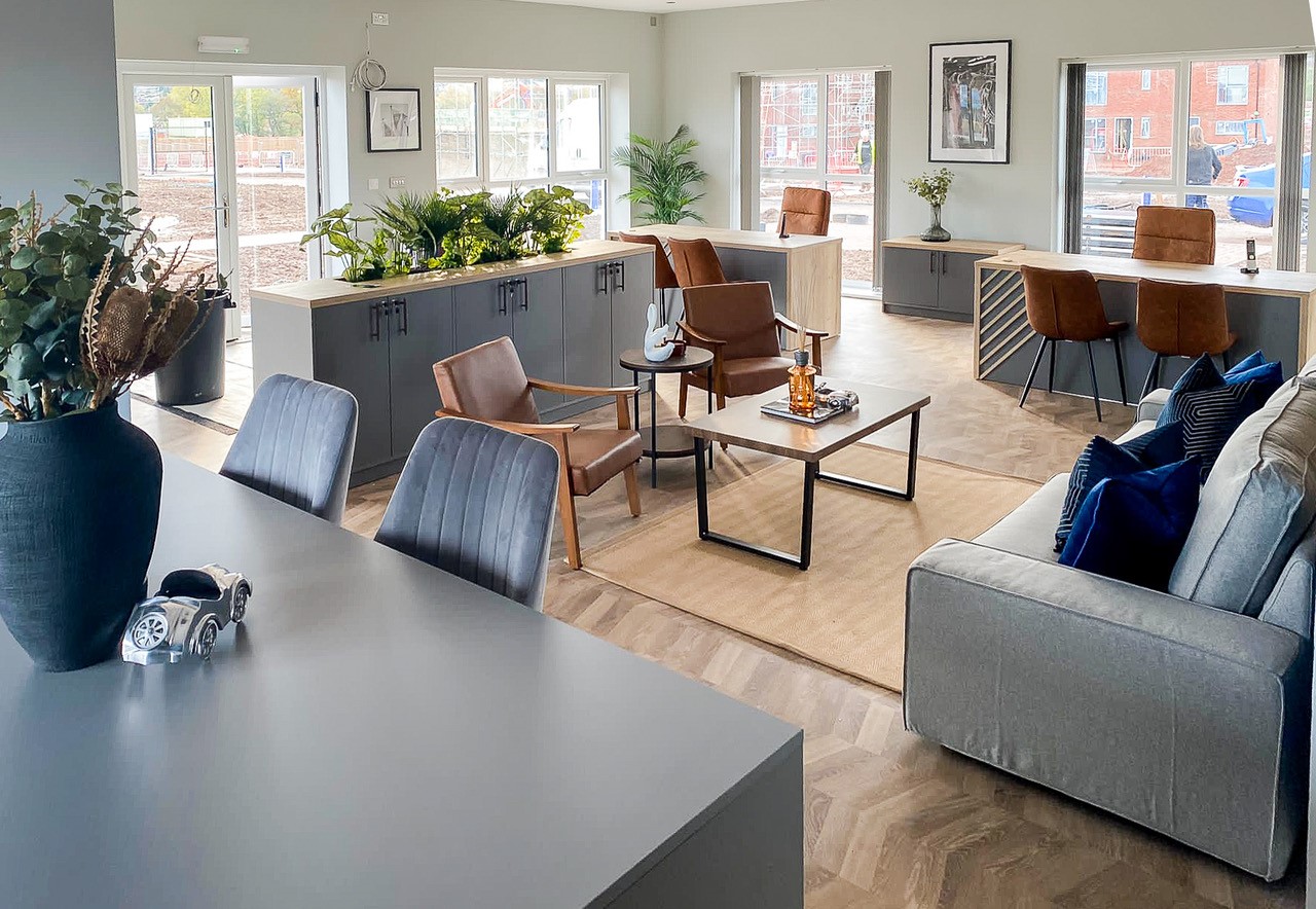
A standalone space is preferable. It’s private, will have plenty of room for display and, unlike using a room within a showhome, it does not disrupt the natural flow of a house. A converted double garage has typically been the default choice for many developers but more recently, we’re seeing purpose-designed sales centres that are single level yet subtly subdivided so an options suite is positioned in an annex or side room.
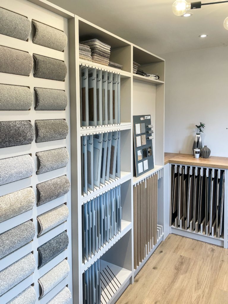
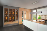
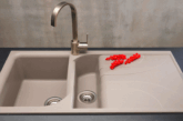
In terms of presentation, this is where the retail example is crucial. All choices must be displayed to sell, meaning they are visible, easily comparable, and easy to understand what the standard range is and what is an upgrade. This includes essential options such as cabinetry, tiling and flooring but newer displays we’ve incorporated show electrical sockets, taps, sinks, shower heads and splashbacks.
A growing trend to watch is digital technology. Some housebuilders have requested in-built touchscreens or VR rooms where purchasers can mix and match their options and see how they will look. So for instance how kitchen cabinetry compares with worktops, how bathrooms look with full or half height tiling, how flooring matches, etc.
The final question is whether an options suite should follow a ‘template’ layout or be designed bespoke to suit the development.
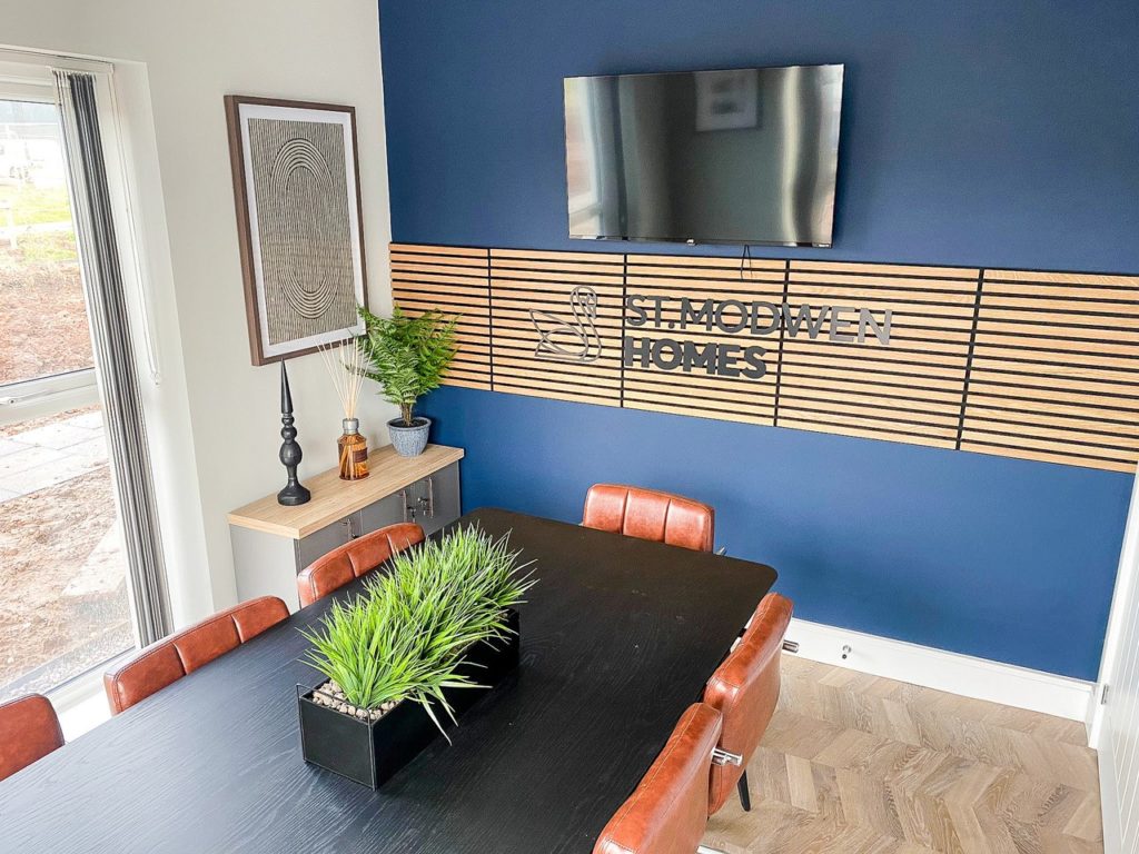 Retaining brand identity is important, so colourways & materials should match the wider sales centre. This ensures the purchaser’s journey within the sales complex remains intact. However, an options suite is all about personalisation, so if there are opportunities to incorporate elements of the local area then this is advisable as it helps reinforce the purchaser’s connection (and commitment) to the development.
All this being said, the space must suit the customer profile too. If your development is aimed at first-time buyers, it’s no good having an exclusive, high-end hotel feel options suite that is unattainable. Similarly, if your product is executive, high six or seven figure homes, you don’t want a sparsely furnished or overly corporate environment. As always with design, the devil’s in the detail.

