 PHPD explores what paint experts predict will be the colour trends for the coming year.
When seeing any room for the first time it is the colours used that create the most immediate response. By using colour effectively housebuilders can help to create a feeling or mood for a space making rooms, or even a whole house, both memorable and desirable.
But more than that, a colour can also tap into the trends going on in the modern world and help designers and housebuilders provide spaces that both reflect and interact with them.
Consequently, each year, as late summer becomes early autumn, two major paint manufactures provide their predictions for the colours they feel will dominate the coming year. And understanding the reasons these colours have been selected can be as important as the colours themselves.
Chinese Porcelain
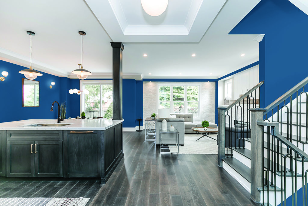
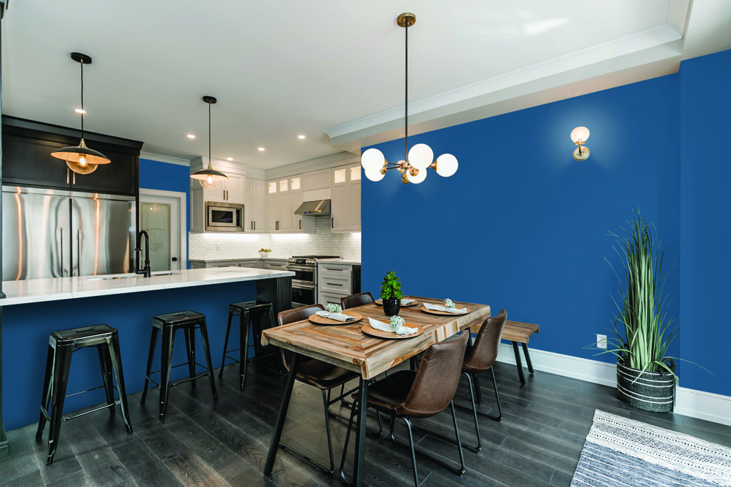
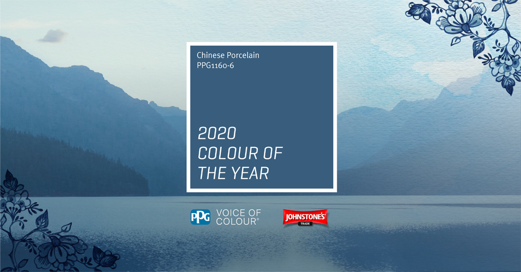
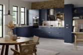
Johnstone’s Trade Colour of the Year 2020 is Chinese Porcelain, a blend of cobalt and moody, ink blue, designed to evokes a sense of calm while offering hopefulness.
Donna Taylor, Principal Colour Consultant at parent company PPG, explained the reasons for its selection: “The faster technology moves and the more convenience it offers, the more we seek activities, experiences and lifestyles that bring a bit of ease and restfulness into our lives. This need for simplicity and escapism is, in part, why colours such as Chinese Porcelain resonate so well across various areas of society. Strong, calming, trustworthy and versatile, this shade helps bring people closer to natural elements such as the sea and sky in order to evoke a sense of serenity.”
The company’s research brought out the increasing need for connection as a coherent theme. Donna said: “As we look to 2020, we can see a strong continuation from last year’s Global Trends Guide, with community and a sense of being standing firmly at the centre. This need for connection starts with blues, such as Chinese Porcelain, as they are the easiest possible entry point from the world of neutrals to the world of colour.”
She continued: “Chinese Porcelain is the perfect hue for creating colour block rooms and is complemented by organic natural wood furniture with a crisp white trim finish. It also works well when layered with additional blues in tufted and velvet furniture, or when paired with trending natural shades.”
Johnstone’s Trade Colour of the Year is the focal point for the broader PPG 2020 Global Colour Trends Forecast, which the company has brought to life through three trend stories, ‘On the Move’, ‘At the Core’ and ‘In the Know’ – each of which is encompassed within an overarching theme of ‘Flow’.
Tranquil Dawn
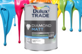
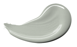
Dulux Trade’s Colour of the Year for 2020 is Tranquil Dawn which it describes as, ‘a versatile, soft green hue with a calming, restful quality that perfectly supports our inclination to blur the boundaries between indoor and outdoor spaces.’
Marianne Shillingford, Creative Director, Dulux UK, explained: “We understand the importance of creating future proofed spaces that have tangible occupant outcomes and as a new decade heralds a new dawn, the hazy pale green tones of Tranquil Dawn are calming and comforting just when occupants need it most in their lives. When paired with neutral pastels and rich jewels it becomes incredibly powerful at creating spaces that encourage making better human connections, enhancing wellbeing and productivity as a result.”
The company believes that this versatile shade of green can stand alone in a space, creating a restorative overtone, or be paired with other colours to act as a soothing anchor to richer or more dynamic shades.
The panel of experts who selected the colour suggested that it reflects a growing desire to understand what it is to be human at a time when advances in technology are making us feel increasingly disconnected from each other.
Heleen van Gent from the AkzoNobel Global Aesthetic Centre explained: “We live so chaotically that our homes, workspaces and other parts of the built environment really need to be safe spaces where we can feel both relaxed and creative. We want to be able to unwind and separate ourselves from the chaos that goes on around us and have time to regroup and find peace.”
Dulux has created four trend palettes which it believes capture the essence of being human and show how Tranquil Dawn can be used to create spaces which enhance what occupants need and want in the year ahead: to seek Meaning, to Care, to Play, and to encourage Creativity.
Heleen added: “When you look at how our ColourFutures palettes have evolved over the years, you can chart the fluctuations in our consumers’ appetite for different colours and spot connections with what is going on in the wider world. For example, in 2017, when consumers felt a need for balance and calm, the palette was dominated by cooler shades of blue and grey. While in 2019, there was then a greater sense of uncertainty which was reflected in a desire for warm, comforting colours that provided solace and refuge.”

